While studying at the Plantin Institute of Typography in Antwerp, Ramiro Espinoza chanced upon the work of an obscure sixteenth-century French punchcutter named François Guyot. The more canonical designs of the period had already been digitized, but Espinoza saw an opportunity to reimagine certain aspects of Guyot’s Gros Canon and Ascendonica types for the contemporary editorial market.
Although Espinoza drew the text sizes first, he initially launched the collectio … > Read article

Retype is proud to announce the release of SuperBlue, a brush-based sans serif with flared letterforms. Its affable shapes make it particularly well suited to relaxed, friendly designs for video games and apps, children’s books, food packaging, greeting cards, and theme park identities.
Seán Sebastian Donohoe, a visual designer with a love for craftsmanship, designed the striking new family. Born and raised in Frederiksberg, Denmark, Seán runs two businesses: his graph … > Read article

Earlier this month, García Media presented its redesign of Handelsblatt, one of Germany’s major financial newspapers. Retype proudly announces that the main type family in the daily’s new design is Guyot, a contemporary reworking of the typefaces cut by sixteenth-century punchcutter François Guyot.
Mario García’s agency, headquartered in New York and Buenos Aires, has been recognized as one of the world’s leading companies specializing in newspaper and magazine design. … > Read article

In November of 2019, Retype introduced Dejanire Headline, a roman type family loosely inspired by an anonymous display typeface found in a type specimen by Claude Lamesle, published in Paris in 1742.
In the months that followed, Ramiro Espinoza worked to expand the system with Dejanire Sans, a refined, multipurpose sans family consisting of twelve fonts. Its compact proportions and neutral appearance make Dejanire Sans especially well suited for corporate websites and commercial … > Read article
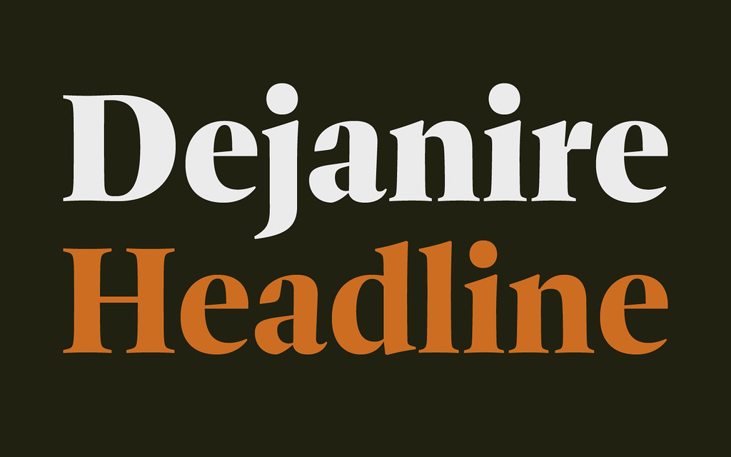
Dejanire is a type family loosely inspired by an anonymous display typeface found in a type specimen published by Claude Lamesle, published in Paris in 1742. It takes its name from Deianira, a Calydonian princess in Greek mythology and the wife of Heracles.
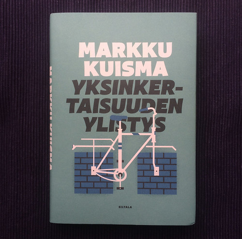
The font originally introduced under the name of Gros canon deux points de gros romain was neither handsome nor elegant, suggesting that its punchcutter wasn’t a very talented artisan. In spite of this, Ramiro Espinoza saw e … > Read article
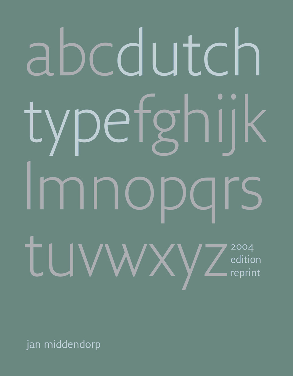
In the beginning of 2018 and after a meeting in which we assured him we will assist him with the production, Jan Middendorp decided time was ripe for a reprint the 2004 edition of Dutch Type, out of print and one of the most sought after second hand typography books of the 21th century. After a very successful crowdfunding campaign it was clear that Dutch Type reprint edition will become a reality.
It took us some months of restoring old backups and replacing corrupted image file … > Read article

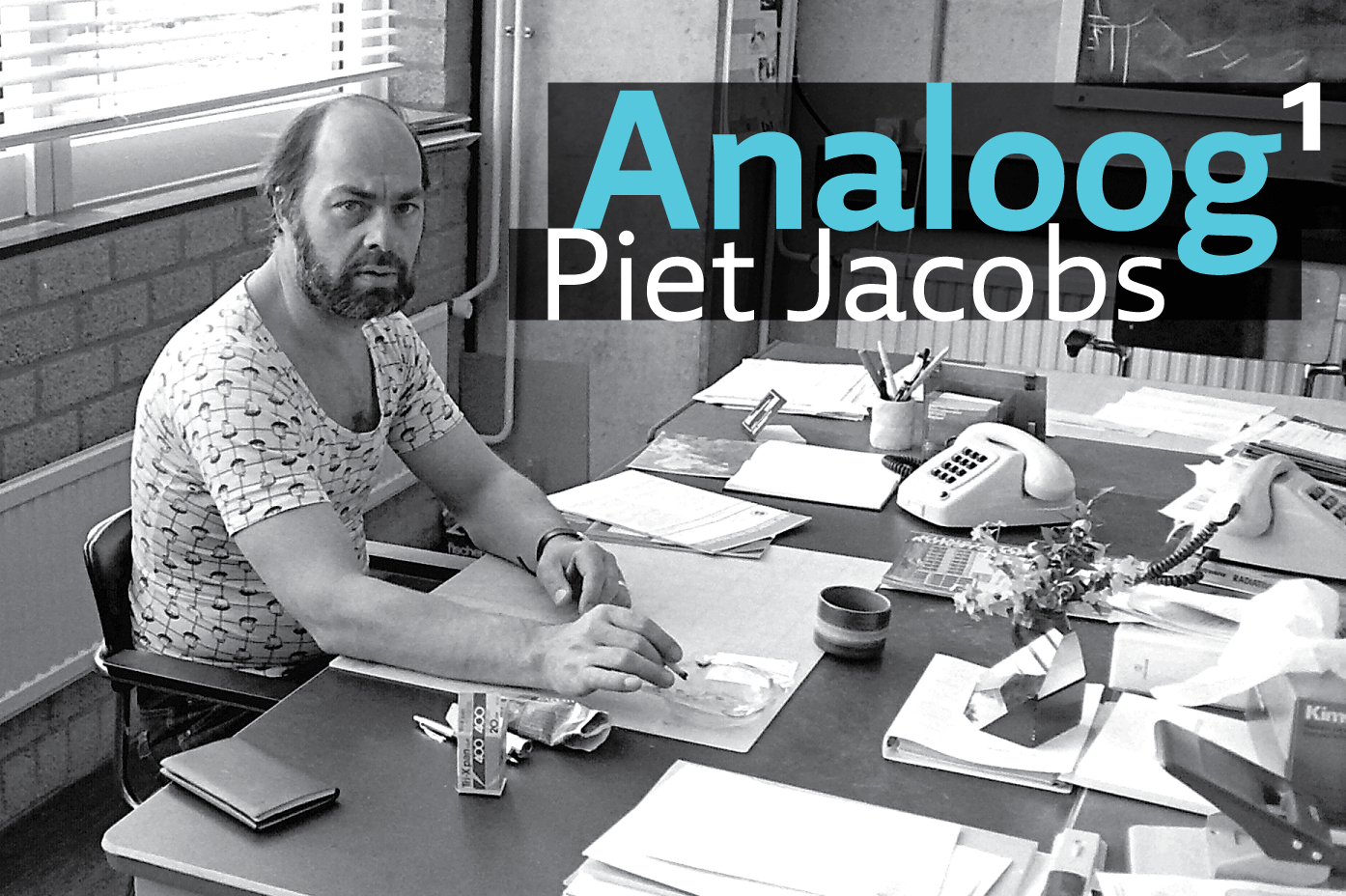
I met Piet Jacobs in November 2017, during the Dutch ‘art of the book’ fair (Boekkunstbeurs) in Leiden. He was in one of the stands, selling a compelling selection of fine Dutch type specimens and booklets. I noticed among them A tot Z, the rare autobiography of Paul H. Rädisch, the famous punchcutter of Jan van Krimpen’s typefaces. After a brief conversation, I purchased the book—a fine green clothbound volume.
It was only when had I arrived home and had time to begin r … > Read article
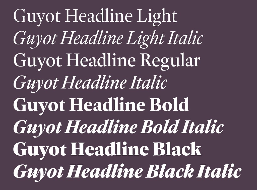
Guyot Headline is the first of two type families inspired by the work of the punchcutter François Guyot, who lived and worked in Antwerp during the sixteenth century.
Ramiro Espinoza got acquainted with the work of Guyot in 2016, while attending the Expert class Type design (EcTd) at Antwerp’s Plantin Institute of Typography. Researching French and Flemish punchcutters with the prospect of creating a revival, Espinoza soon realized that the work of the most important masters o … > Read article
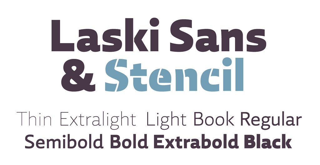
In 2014 we presented Paula Mastrangelo’s first type family, Laski Slab. Over the last year, Ramiro Espinoza worked to expand the system and today we are proudly introducing Laski Sans, a refined humanistic sans addressing many of today’s design requirements, and specifically optimized for editorial and corporate use.
Laski Sans is a family of 20 fonts with weights finely balanced so that they can be easily combined in a wide range of environments. Its open forms and solid str … > Read article
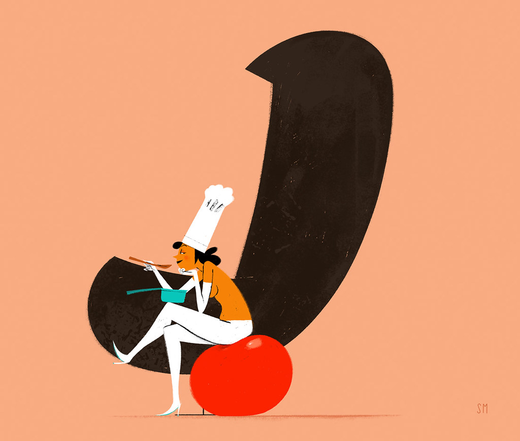
Simone Massoni is an Italian illustrator with a deep appreciation for typography. He runs the website chicksandtypes.com where he likes to pay homage to some of his favorite fonts. In past months well known typefaces like Meta, Archer and Matrix – among others, have been interpreted pairing each font with the illustration of a sensual woman that – in Massoni’s view – embodies the typeface’s attributes.
Last month it was the turn of our font Tomate and Massoni cr … > Read article
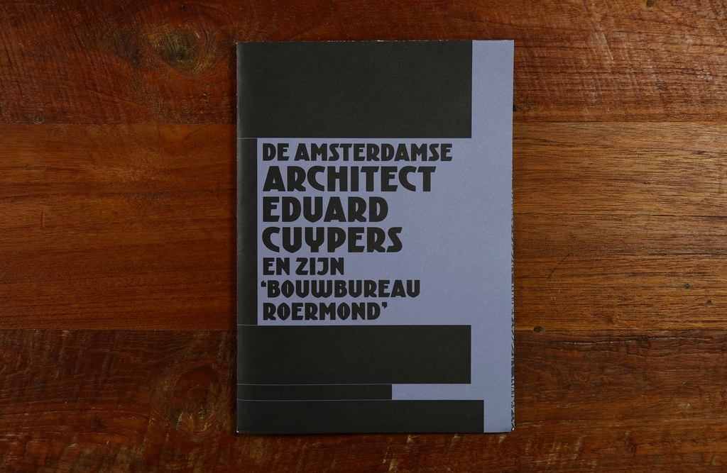
We are fans of the Amsterdam School and at least once a year we pay a visit to Het Schip, the museum dedicated to this avant-garde movement.
Last time we were there, we found this fine publication dedicated to the architect Eduard Cuypers. Its designer, Joep Pohlen from Polka Design chose Kurversbrug as the cover and headlines typeface and of course we think it was the right decision. 🙂
… > Read article
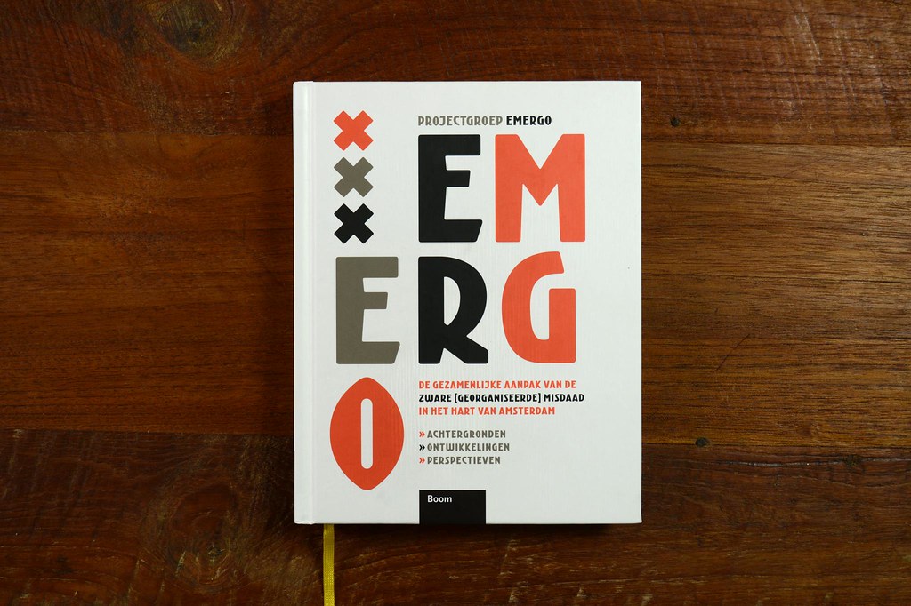
Emergo is an interesting report on Amsterdam organized crime published by Boom Publishers. The book was designed by René van der Hooren making intensive use of our font family Krurversbrug. Much appreciated, René. We love to see book designers making good use of our fonts.
… > Read article

Our typeface Laski Slab –designed by Paula Mastrangelo & Ramiro Espinoza – has been awarded with the highest prize of the Hiii Typography contest. Needless to say we feel deeply honored for receiving it. Thanks a lot to the jury and congratulations to the rest of the winers.
… > Read article
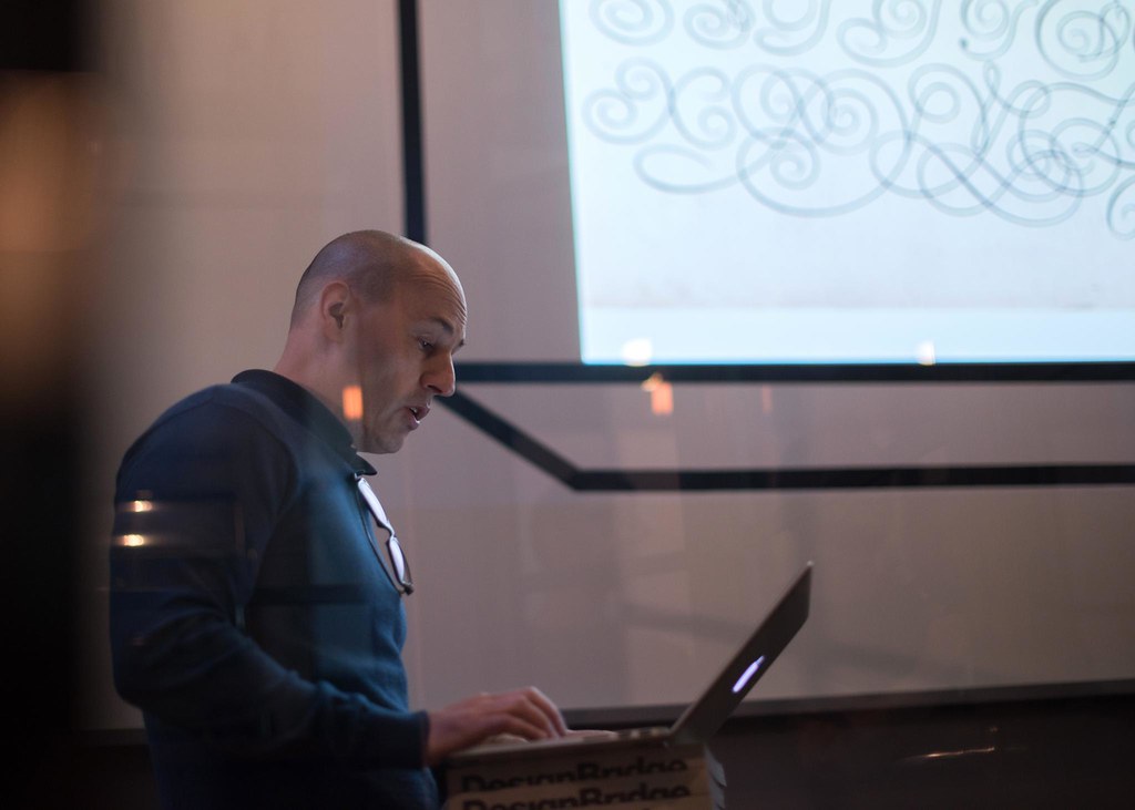
Kerning fonts is a tiring activity that can put a big stress on your extremities. Following the advice given at Robothon conference by Andy Clymer, we are experimenting using MetricsMachine and an USB’s game pad with the help of the universal driver USB Overdrive. It works like a charm. We specially like to have a handy way to flip the selected pair when checking kerning symmetry. The next kerning work at Retype is much probably going to be performed with this method.
… > Read article
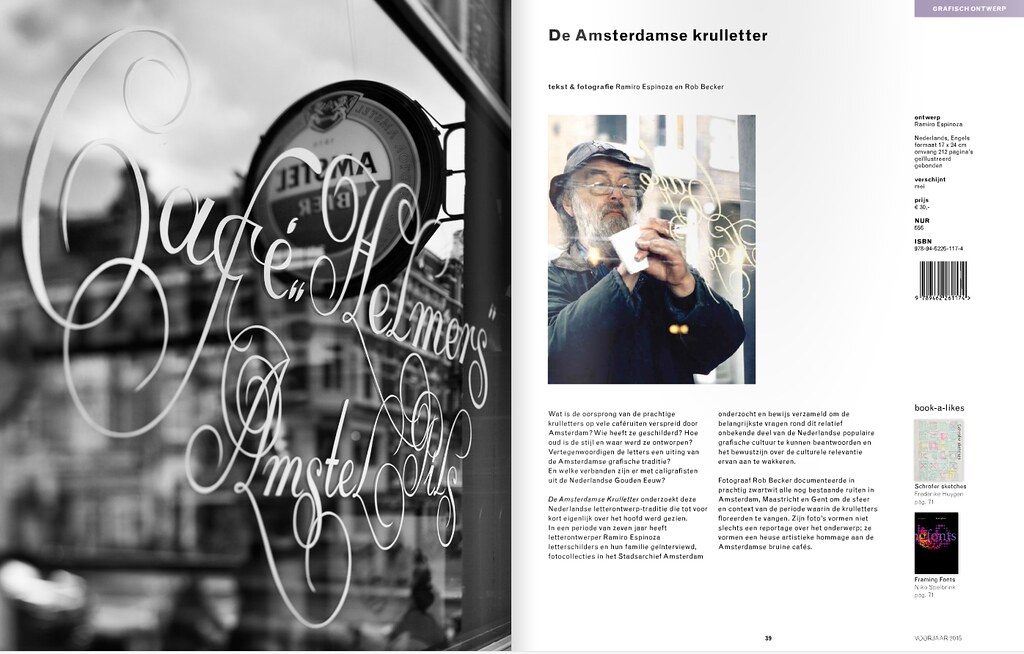
“De Amsterdamse Krulletter“, an exhaustive research about the Amsterdam’s Curly Letter by Ramiro Espinoza and Rob Becker will be published by Lecuris.nl in April/2015. Stay tuned for news about the book presentation.
Click here for more information.
“De Amsterdamse Krulletter” can be purchased following this link
… > Read article
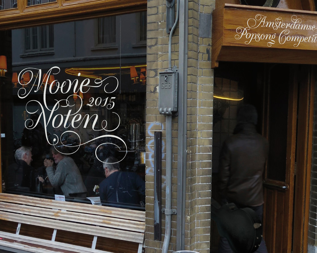
Our friend Donald Beekman from Studio DBXL has designed with our font Krul a beautiful campaign for Mooie Noten, Amsterdam’s singer-songwriter competition. Great job, Donald!
… > Read article
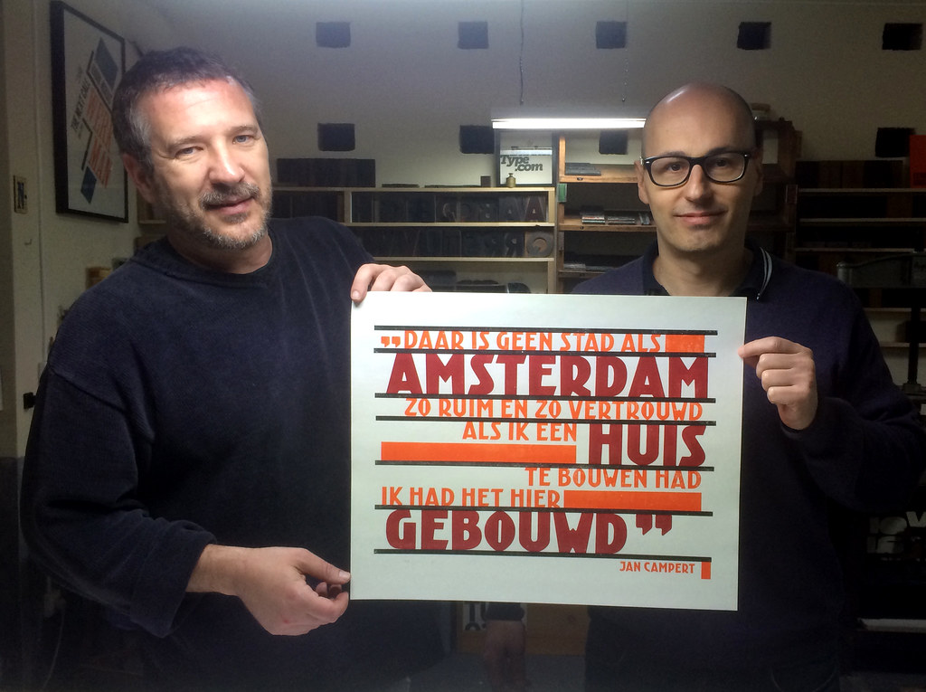
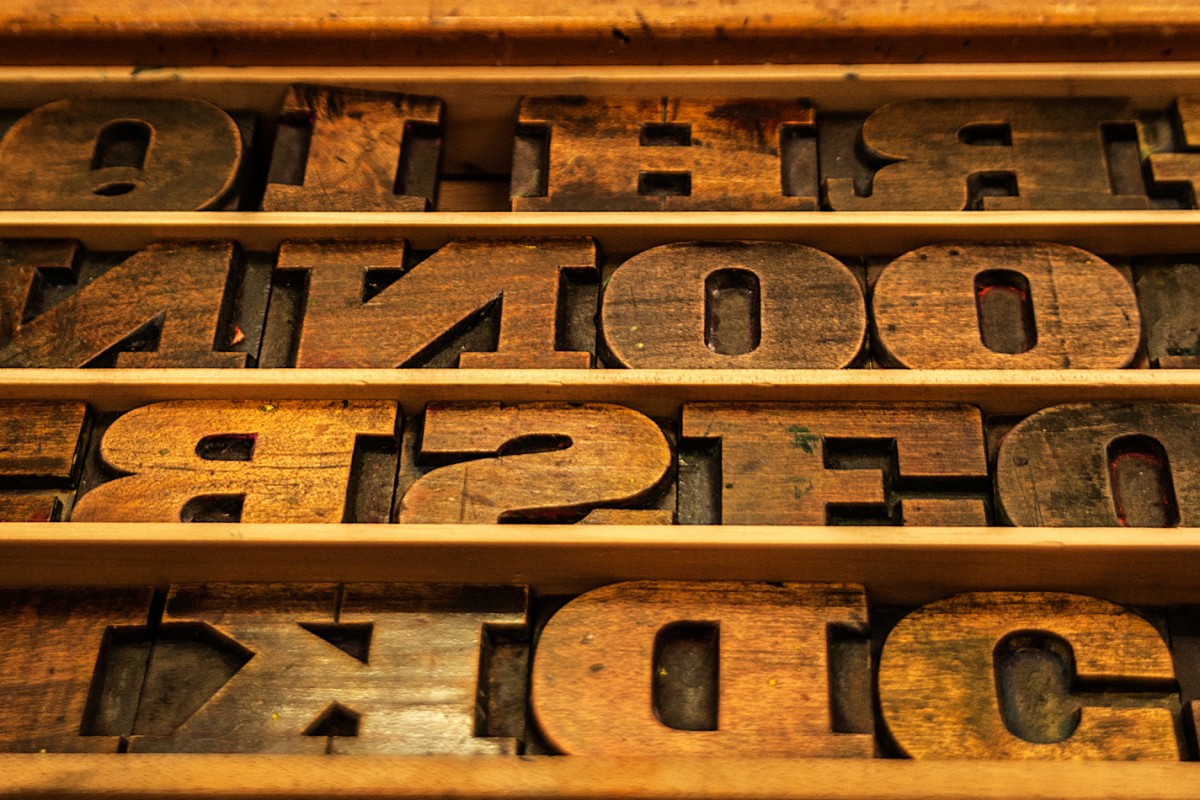
We have been experimenting with our friends of BunkerType with a wood type version of Kurversbrug, the revival of Amsterdam’s bridge letters. We chose a fragment of a famous poem by Jan Campert (“Een Amsterdamsch lied”) and with it a poster in the spirit of The Amsterdam School avant-garde was designed and printed. Stay tuned, the poster will be made available soon.
… > Read article
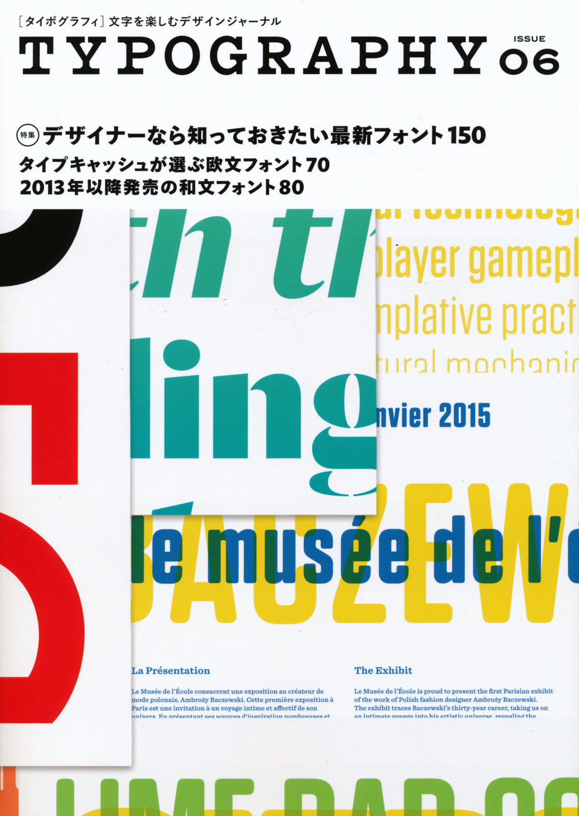
Our typeface Laski Slab has been generously featured in the Japanese magazine Typography #6. It’s a well designed publication with a careful selection of recently published typefaces and related news on typography. Thanks a lot to Yuko Miyago and his team.
… > Read article
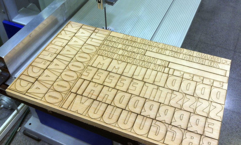
With our colleagues from Bunker Type we are planning a wood type version of Kurversbrug. Soon this new incarnation of the Amsterdam’s bridge letters (brugletter) will be ready and a set of posters dedicated to the city will be printed with them. Stay tuned for more news!
… > Read article

Few months ago we shared here some outstanding posters Richard Wolfströme designed with our Kade typeface. Now he has employed Laski Slab to design Here and Now, a magazine for The Academy of Urbanism. We think it is a beautiful piece of editorial design and we are glad our type family is playing an important rol in it. As always, thanks Richard for sharing your work with us.
… > Read article
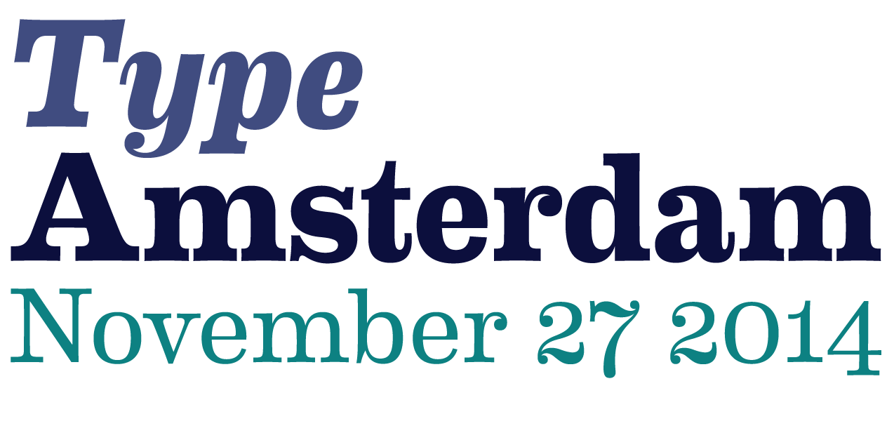
As every year the Bijzondere Collecties department of the University of Amsterdam is organizing the Type Amsterdam event. In this opportunity, the lectures will delivered by: Nina Stoessinger, Sébastien Morlighem, Huda Smitshuijzen AbiFarès and Ron van Roon.
You can subscribe in this webpage, but don’t wait too much since the venue has a rather limited capacity.
… > Read article
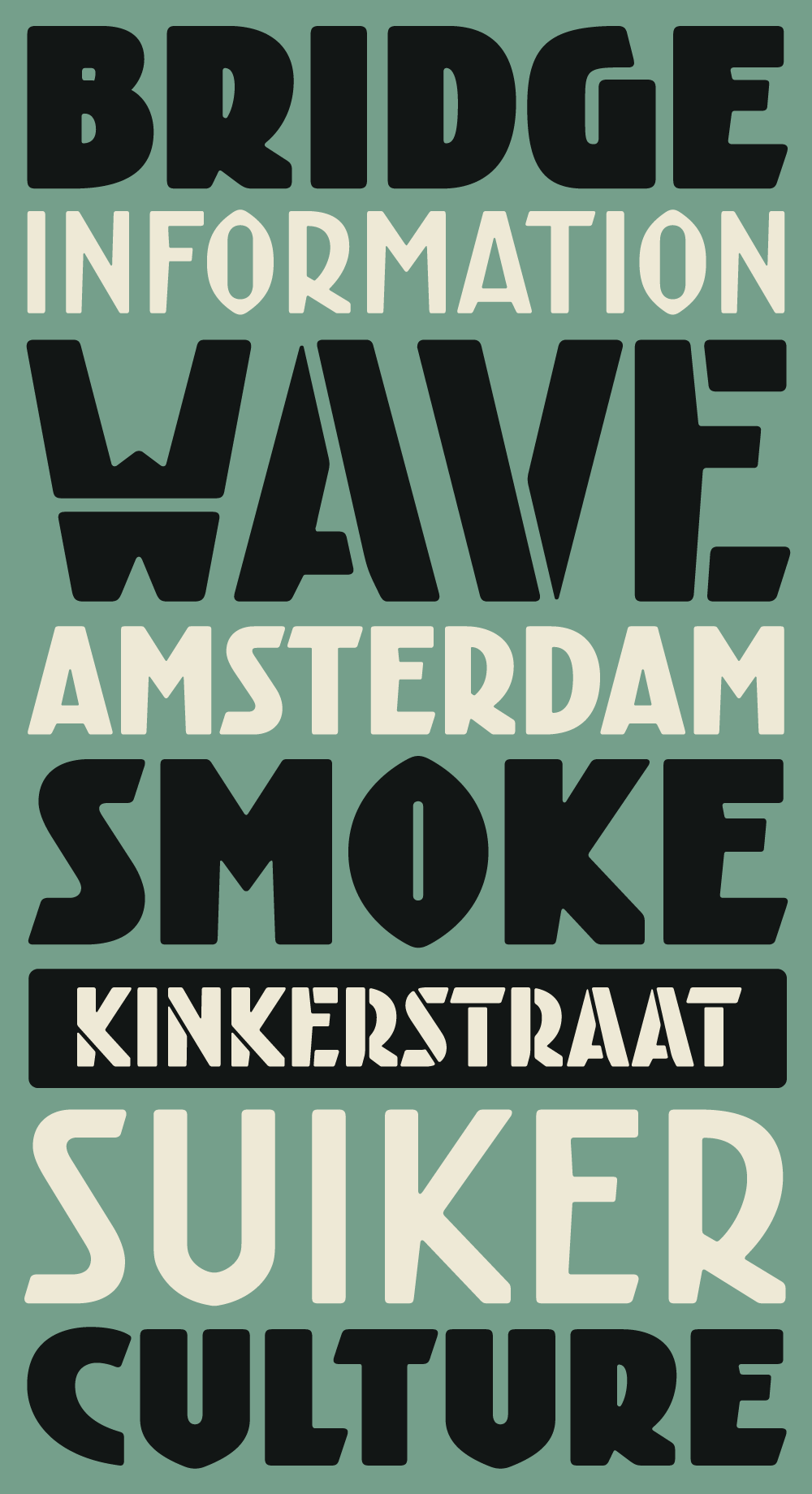
Kurversbrug – our interpretation of the idiosyncratic alphabet found on the bridges in Amsterdam – was the first type family released by Retype back in 2007. From the onset the Kurversbrug typefaces were very well received, and have been applied in countless design projects, websites and advertising campaigns. Even the Amsterdam municipality started using Kurversbrug in a new series of bridge nameplates. This made us realize a revamp of the family was necessary, so we began wo … > Read article
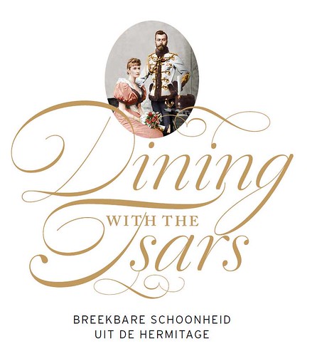
We were very pleased to find that Berry Slok Studio from Amsterdam chose our script font Dulcinea to design the poster, brochures and catalogue of the Hermitage Museum‘s exhibition ‘Dining with the Tsars’. It looks great, we hope to see soon more works from this studio.
… > Read article
Chil3 is an Australian design studio that creates stunning works of identity and editorial design. They have recently designed the identity for the West Australian Symphony Orchestra and have chosen David Quay’s Kade as its main typeface. We love how it looks in the context of this solid design work.
… > Read article
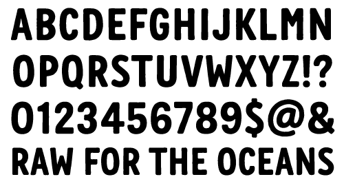
We have recently worked with Renee Ramraj creating a font for the G-Star’s campaign ‘Raw for the oceans’. The alphabet plays an important part in this identity where it must reaffirm the messages behind the environmentally-conscious initiative.
… > Read article
Finnish designer Tom Backström from mustakirahvi.net has designed this stunning book jacket with our typeface Winco. It looks great Tom, thanks a lot for letting us know about it!
… > Read article
For those type lovers who prefer the smell of printed specimens, we’ve made a Laski Slab booklet displaying every weight and showing their potential with a variety of design examples. It can be ordered here.
… > Read article

Bas van Vuurde is a talented graphic designer and typographer who runs a studio in the city on Haarlem. He has recently designed a graphic identity for “De Vrijplaats” (a rehabilitation center). We are glad to see again Kade as one of the central elements of a very well balanced identity.
… > Read article
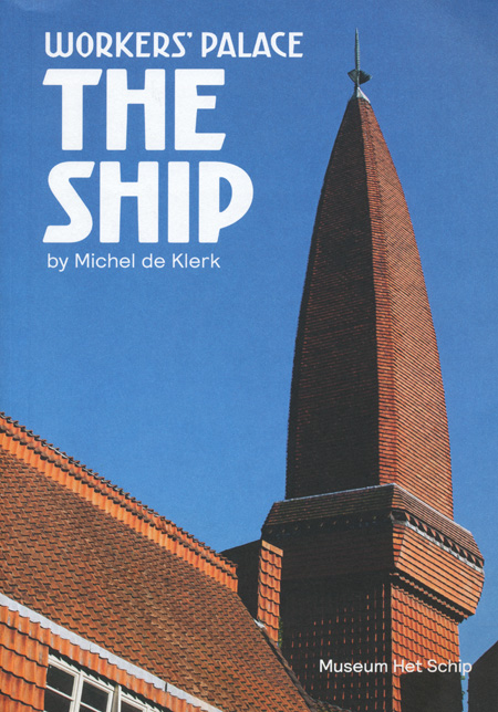
The Amsterdam School Museum in Amsterdam has published a beautiful book featuring our font Kurversbrug in the cover and titles. The book, designed by Rutger Vos, is dedicated to one of its more important milestones: Het Schip (The Ship). This building marks the highest point of socialhousing in the Netherlands. There, workers were not only provided with good quality accommodation, but they were also given a beautiful home. So, if you ever travel to Amsterdam, forget about silly … > Read article
Ayer terminó el taller que brindamos con Laura Meseguer en Congreso Internacional de Tipografía de Valencia. A pesar de que la demanda de trabajo fue alta y grande el desafío de utilizar técnicas nuevas, los asistentes faenaron duro y cumplieron con las consignas de cada etapa arribando a resultados de calidad.
La ocasión representó para nosotros una experiencia muy grata que esperamos poder reiterar en otra oportunidad.
Imágenes del taller y los trabajos en Flickr.
Grupo … > Read article
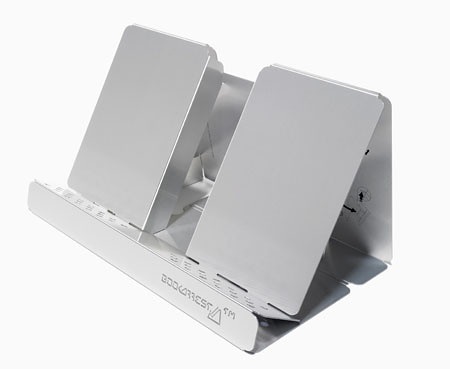
«Bookarrest» es un implemento diseñado para asistir la lectura. Quienes disfrutamos de leer conocemos ya lo incómodo que resulta hacerlo con un libro dispuesto horizontalmente sobre la mesa. Luego de poco tiempo, la nuca molesta y el cuerpo termina adoptando una posición perjudicial para la columna.
Para solucionar este problema, Robert Pachowski, un diseñador industrial inglés, desarrolló un atril plegable de aluminio que no posee partes móviles. Está diseñado de tal … > Read article

El día 24 de agosto en Amsterdam se realizará un ciclo de conferencias sobre nuevas expresiones culturales del mundo árabe auspiciado por Mediamatic. En el marco de esas jornadas 5 nuevas tipografías árabes serán presentadas.
Entre los disertantes del simposio estarán: Huda Smitshuijzen AbiFarès (Khatt Foundation), Willem Velthoven (Khatt Foundation / Stichting Mediamatic), Dr. Goeffrey Roper (Index Islamicus, London), J.R. Osborn (University of Callifornia, San Diego) … > Read article
No alcanzan 3 días para disfrutar esta ciudad, pero pasé buenos momentos allí. Pude perderme durante un dia completo explorando Mitte, deteniendome a tomar Jägermeister (es que me gusta el logo) de cuando en cuando y jugando ping pong con los estudiantes de Dr. Pong en el bonito barrio de Prenzlauer Berg (que me recordó inevitablemente a Palermo Viejo, Buenos Aires).
Mi hotel estaba justo en el límite de los barrios Kreuzberg y Mitte. En Kreuzberg existen una infinidad d … > Read article
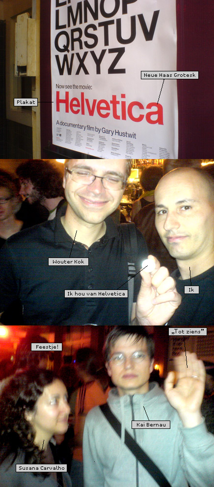
Estuve anoche en la premier del documental «Helvetica» en Kriterion. La peli me pareció modesta, pero buena. Los testimonios son bastante interesantes, de hecho uno se queda con ganas de un poco más de peli. Luego de finalizado el documental pudimos preguntarle algunas cosas al director y como cierre hubo una fiesta temática decorada con afiches (no muy agraciados) realizados por alumnos de la Rietveld Academie. Mi cámara se quedó sin baterías y tuve que recurrir al teléf … > Read article

No voy a escribir nada sobre un film del que ya todos han oído hablar. Sólo diré que este viernes 22 de junio es la premier holandesa de la peli en el muy bonito cine-club Kriterion de Amsterdam. Un debate y una fiesta temática están anunciadas para dar un buen marco a este pequeño acontencimiento de la comunidad tipográfica.
Ya tengo elegida mi remera para la ocasión.
… > Read article

La versión para test del sitio de mi mini fundición ReType, está en línea. El primer paquete de fuentes «Kurversbrug» está listo y disponible para la compra. En los meses que vienen más fuentes y pesos se irán sumando al catálogo, así como algunas remeras para los amantes de vestir «frikeadas» tipográficas.
Se agradecen comentarios, correcciones, referencias de links rotos, colaboraciones en el desarrollo del sitio, sugerencias técnicas sobre «content management» … > Read article
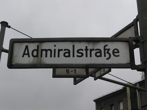
Tanto el «Jordaan» como «De Pijp» son barrios especiales de Amsterdam. El «Jordaan» es mi preferido. Fue el primer barrio en donde comencé a conocer una Amsterdam que tenía nada que ver con la de los folletos turísticos. Pero en ambos barrios puede uno encontrarse con letras interesantes. El «Jordaan» esta poblado de «bruin kroegen» (café marrones) y eso lo pone más cerca de mi afecto, pero «De Pijp» tiene el mejor mercado de Amsterdam y una larga tradición de ca … > Read article
Simpática animación de una enamorada de la tipografía Akzidenz Grotesk. Yo prefiero Helvetica, pero tanto la banda de sonido como la animación tienen una atractiva ingenuidad. (Via Typographer.org)
… > Read article
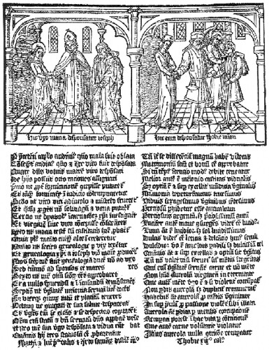
El estudio del cuerpo de libros y fragmentos conocidos como «prototipografía» es apasionante. Se trata de impresos tipográficos de naturaleza bastante cruda y primitiva que son testimonio de una etapa casi desconocida de la historia del libro impreso.
Como es sabido, el primer libro impreso datado fue el «Libro de Salmos de Maguncia» el cual fue publicado por Fust y Schoeffer en 1457. El mismo es una obra de notable belleza y excelente composición. Tambien las biblias de 3 … > Read article